Often during a class or demonstration, I’ll remind people to place the inky brayer on its stand or to keep track of which side of the paper is the right side. It’s easy to become absorbed in the printmaking process; to get excited about the possibilities of color and pattern and lose track of things.
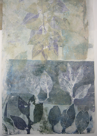
Well that happened to me last night. I was intrigued by the patterns that developed on my palette and decided to make those patterns part of the print of a twig from a tart cherry tree. In the process, I printed some images on the front side of the paper and some on the back. I know better, and the front was easy to determine because of the specks of gold leaf in the Sprinkle Gold paper from Wet Paint. Because the paper is somewhat translucent, this type of error can occur, although it may not be an error at all—simply a new way of looking at a familiar situation.
And as I looked at the print, and emailed the image to my teacher, she raised the question of whether the print is most appropriately viewed vertically or horizontally. What do you think?

The “right” side of a print of a tart cherry tree twig on Sprinkle Gold paper.

The print’s “wrong” side, shown in a horizontal orientation.
My teacher, Sonja Larsen, is a master at creating interesting backgrounds for nature prints. In fact, there’s a six-page chapter and a two-page chapter on background techniques in the book Sonja and John Doughty co-authored. The book’s title is Creating Art From Nature.
One can paint, spray, drip, & fling watercolor paint onto dampened paper—Sumi-E/Oriental papers, printmaking, or watercolor papers—to create colorful backgrounds. Or, after spreading a watercolor wash onto the printmaking paper (this suggestion does not work well with the softer Oriental papers), place very flattened leaves onto the wash, or for a more geometric background pattern, place crumpled clear food wrap onto the painted, wet paper. Allow the paper to dry before dampening it in preparation for printing.
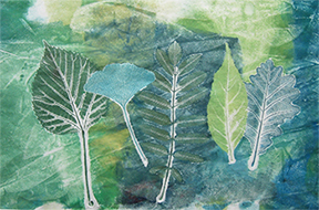
The print below is an example of flattened Cranesbill Geranium (Geraniaceae) leaves displacing the colorful background paint. The leaves created a pattern over which the Cranesbill Geranium plant was then printed.

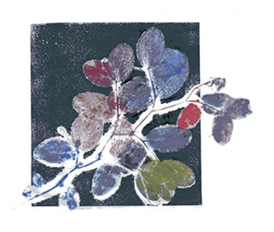
Sometimes it’s fun to begin with a colorful background, place inked specimens on top of the inked background, and pull a print. The square shape was created by taping the shiny side of Reynold’s Freezer Paper in place to create a boundary to contain the strokes of the inked brayer. The image shown below is of my first monotype, made during Sonja Larsen’s 2007 nature printing workshop.
I found the twig on a walk in the woods that surrounded the now-closed family resort where about a dozen eager nature printers gathered to print and learn, celebrate the summer solstice, and have a memorable time.

When I’m demonstrating or teaching nature printing, I often caution people about becoming too exuberated. This condition, described here with a not-quite-official word, often results in brayers fastening to the ink on the palette as the printer enthusiastically pulls their print.
However, I, too, become exuberated; I’m eager to explore the patterns and colors on the palette before devoting time to discovering the beauty of printing a specimen in one or more ink colors.
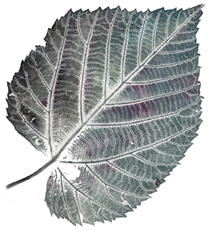
I’m reminded of the print of the linden leaf shown below. The specimen grew as a sucker at the base of a neighborhood tree. Although the leaf’s diameter was similar to that of a dinner plate, I used a two-inch soft-rubber brayer to apply Speedball water-soluble printmaking ink with a very light touch. By rolling the brayer through a variety of inks on my palette, the brayer proved to be almost as expressive as a paintbrush.

Following my participation in the annual Art-A-Whirl event in northeast Minneapolis last weekend, I feel as though I am a lucky winner to have had that opportunity to show and sell my work. What fun! Thank you if you stopped by to visit, and if you purchased some of my note cards or provided me with your email address for a drawing to win one of my prints.
The small slips of paper with contact information were put in a basket and tossed around. My friend and fellow exhibitor, Kim Gordon, closed her eyes and plucked one of the slips from the mound of papers. The lucky winner of that drawing was Al, who lives in south Minneapolis and was also my art teacher at Minneapolis Central High School a mere few decades ago. Al was among the friends, students, neighbors, and colleagues who received my emailed notice about events and classes that you can also view on the “About” page here.
What’s especially meaningful about Al winning the print is that I learned about printmaking from him. He also introduced my classmates and me to calligraphy with a C-series broad-edge Speedball pen nib. The first print I ever made was a linoleum cut. The material was a flat rectangle of green linoleum with a burlap back. We used Speedball cutting tools to incise the design in the linoleum, cutting the pattern into the soft surface. Tissue paper was glued to heavy paper, the linoleum was coated with black printmaking ink, and a print was made. You can see that aged, yellowed print below. Even long ago I was interested in recording the beauty of plants.

If you know the adage, “If it seems too good to be true, it probably is,” then please permit me to create a new, memorable nature-printing-related philosophy which is: “If a plant appears to be too difficult to successfully print, it probably is.”
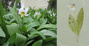
Today I printed Christmas cactus which has been blooming intermittently since Halloween. The leaves reproduced nicely; the complex, bulbous blossoms look like a tangled mess. I also attempted to print a Trout Lily (Erythronium propullans) which is, in addition to being on the “endangered species” list, a really pretty little plant. The petals curl in a most alluring manner and the curved, upright leaves are adorned with an attractive, mottled pattern of irregular brown spots on a muted-green background.
Capturing the curve of the six petals turned out to be impossible for me to replicate in two dimensions. An added obstacle was that the receptacle (the part of the flower stalk where the flowers are attached) was so three dimensional it poked through the paper when I pressed the paper against the inked plant. And the green ink color for the leaves that looked so right is clearly too yellow. The attractive green paper is a gift from my teacher and friend, Sonja. The green background allows white flowers to be visible, something not possible when printing on white paper.
Despite my disappointment, I enjoyed admiring the plant in the garden of my neighborhood friend, Marie, and I learned a lot about the plant—from attempting to print it and reading about it.

On the weekend of May 16–18, my friend, fellow artist Kim Gordon, and I will be participating for the first time in Art-A-Whirl—“the largest open studio tour in the country.” Fiber artist Sandra Brick extended an invitation to us from Kira McCarty, owner of the hair and makeup studio OnsiteMUSE. We will share space with a photographer, jeweler, and vintage clothing artist in suite 225 in the well-regarded Q.arma Building, 1224 Quincy Street NE in Minneapolis. There’s a spacious parking lot south of the building with driveways on Broadway and Quincy Streets NE. Kim and I look forward to seeing you next weekend.

More than 500 artists will show their work in 60 locations during Art-A-Whirl. An attractive, informative guide book is available that has a helpful map on page 20. Two free trolley/shuttles circulate clockwise among the locations.
Three more friends are showing their work during Art-A-Whirl. You can see Sandra Brick’s intricate shibori garments and artwork at studio 394 in the Northrup King Building, 1500 Jackson St. NE; Terra Rathai’s AvantGarden Photography at the Ruckus Art Shop, Waterbury Building, 1121 Jackson St. NE, #117; and Marjorie Fedyszyn’s sculptural fiber forms in studio 200, Casket Arts Building, 681-17th Ave. NE.
As if the art isn’t exciting enough, food trucks will be strategically parked and music will be performed throughout the days and evenings.
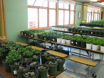
What an uplifting event this was—so well organized and welcoming—hosted by Metro Blooms. Throngs of gardeners purchased trays of the hearty variety of perennials, annuals, and vegetables provided by Glacial Ridge Growers, and swarms of dedicated, conscientious volunteers circulated nonstop, fulfilling all sorts of tasks.
I was happy for fruitful conversations with gardeners and fellow exhibitors, the sale of some of my note cards, and the opportunity to let you know about classes I’ll be teaching this summer at the Edina Art Center. (Look for the classes listed in the “Related Arts” category.) I look forward to seeing you in class—or in the garden.

It’s raining—again—today. Even though the winter was the fiercest in about 30 years, and we received plenty of snow, we need rain to thwart persistent drought conditions. I cleaned the mud from the rain gauge so I can read the satisfying depths of moisture we’ll receive.
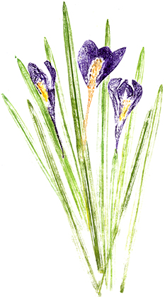
Bloodroot are several inches high in a backyard garden, but they don’t bloom on cloudy days. And although no crocus bloom in our yard, nor in any of those that I pass while walking the dogs, my print of crocus is shown here so you can enjoy a flower that launches the season of spring here in Minnesota.

In a recent rollicking phone conversation with a fellow Nature Printing Society member, Jeanne (who lives near Chicago) divulged that she’s now pulling out prints from her stash to give as gifts to friends—to the delight of her friends.
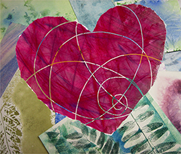
I’ve been doing the same thing, as shown by the composition below. I was in a hurry (what else is new?) to make a Valentine for my husband. After assembling some disparate nature prints on my work table, I took a photo of the physical montage. I then scanned a watercolor/pastel heart that originally was the image in an ad for heart scans offered to patients by a radiological-practice client of ours. In Photoshop, I drew the swirly, transparent path through the artwork. The images were assembled from two layers in an InDesign layout and reproduced as a card. What’s in your stash that will delight your Valentine?
