Category: How to

Thank you for stopping in

The Fresh Art Studio Tour was great fun—as usual. Conversations with stimulating guests were abundant as was enjoying the artful surroundings of site 12, with its ceramics and paintings by Kaye, raku by Mark, jewelry by Pat, gardens, guinea hens, chickens, my nature prints, and very wet grass + mud. During the 24 hours between Friday and Saturday afternoon, we received 5.5″ of rain.

If you’re a printmaker, you know that humid weather keeps the ink “open” and the paper damp, making last weekend ideal for printmaking. As guests strolled through Kaye’s studio, I kept printing. You may have joined in the fun and made a print to take home.

The print below shows three leaves from the prairie plant Leadplant (Amorpha canescens). One guest used red and gold ink; the next guest wanted a cooler palette of green, turquoise, and blue ink. I seldom clean the freezer-paper palette between guests, due partly to laziness but mainly because it’s exciting to see what the results may be when working with the colors and patterns left on the palette. Sometimes I refer to these as “residual” prints, honoring the “remains” left by previous printers. To the inky palette, I inked and added the three leaves.

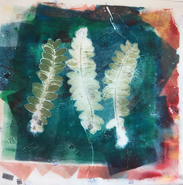
A “residual” print of Leadplant leaves on a colorful inked palette.

I will give this print to dear friends Lynn and Wayne, whose 40th wedding anniversary was the day after they watched this print being pulled from the inky palette. You may be wondering what the small floating squares are in the background of the print. They’re in the paper, a sheet called Bangkok News, an affordable Oriental paper I purchase at Wet Paint, of course.

If you plan to take up the artistic sport of nature printing, Wet Paint has all of the supplies. Stop in to their shop on Grand Avenue in St. Paul, Minnesota, or contact them to fill a mail order for these simple, affordable supplies:

• 2” Speedball soft-rubber brayer
• Speedball water-soluble printmaking inks: black, red, yellow, blue, and green. If your budget can manage it, also purchase the colors dark yellow and turquoise. These provide unexpected influences when you mix them with the primary colors—or each other!
• A plastic palette knife (or use a plastic picnic knife)
• A roll of Sparkle Gold Oriental paper, 13” wide by 10’ (10 sheets per package)

You will also need a palette for rolling out your ink and applying it to your leaves. You can use the shiny side of Reynolds-brand freezer paper, a piece of Plexiglas or window glass (with the edges taped for safety), or a sheet of 18”x12” quilter’s Mylar.

After you get your supplies arranged, your paper dampened, and your leaves selected, be sure to have fun! I know you will.


Illuminating mistakes

On Saturday, at the reception for an exhibition of my nature prints combined with lettering, my friend, Linda, asked how I’d created one of the collages. The one to which she referred (shown below) was the most complicated. I wasn’t sure I could explain the process of putting it together. It’s not a matter of being cagey; not an unwillingness to share “the family recipe.” No, it’s more a matter of being so absorbed in—or dazzled by—the colorful, patterned possibilities of the prints that I lose track of tangible factors such as time, process, sequence, and decisions.

In fact, the method I use is to make copies of the original prints, then tear them apart and position them onto the substrate (support surface). When I’m satisfied with the composition, I take a picture of it. I then unassemble the collage, numbering each piece. When I start to assemble the actual collage in which I use the original artwork, I follow the numbers, putting piece number one in place first, followed by the second piece, and so on.

Do you wonder why I came up with this plan? Naturally it’s due to another lesson learned “the hard way.” Of course, I pasted a piece to the substrate that I’d intended to place on top of something else. The piece had this lovely, ragged torn edge that was now never going to be seen because it would be covered by something else. I mourned my foolishness for a minute, then got going. Hey, there are more illuminating mistakes in my future!

Two distinct prints came together to create this collage. You’re seeing the whole, “raw” collage here. I cropped it to make A-2-sized note cards, and it’s exhibited in a square frame. The translation of the rubber-stamp seal is “Wisdom,” a quality for which I’m always longing for more. • Yoga sutra IV.22 from Bernard Bouanchaud’s book “The Essence of Yoga.”

Thinking about ink

As I was printing this afternoon, I was thinking of you—and the questions about ink that come up during classes and demos.

Your prints will be more interesting if you mix one ink color with another, or, as an alternative, “dirty up” the ink by adding a tiny amount of black ink. Using ink straight from the tube just looks too ordinary.When mixing colors, place a “nurdle” (a small amount) of the lighter color of ink on your palette. Add to that nurdle a squeeze of a second color—the darker and more influential color.

The palette
A palette is the smooth surface on which we roll out the ink and also apply the ink to the specimens. Any smooth, flat, clean surface works including a piece of glass, Plexiglas, quilter’s Mylar (available at Joann for about $4), or a piece of Reynold’s freezer paper with the shiny side placed facing up, held in place on a smooth table with masking tape.

Details about ink
Speedball water-soluble printmaking inks are affordable, readily available, easy to use, and enjoyable. What’s fun about these inks is that although they dry fairly quickly, your mixing palette can be “reactivated” by misting it with water from your spray bottle. The colors I always have nearby are the primary colors—red, yellow, and blue—plus black, green (it’s difficult to mix a true green from blue and yellow), dark yellow, turquoise, metallic gold, and extender. Brown, orange, and violet (purple) are pleasing colors, but not essential. Dark pink, while a favorite with young girls, will stain your soft-rubber brayer and is not as lightfast as the other inks mentioned above.

Extender is a magical component in the printing process. Extender is a colorless medium that “extends” color, stretching the pigment you add to the extender by making the color less intense or more transparent. Treat the extender as your lighter color and add your inks to it—in small amounts.

The process of inking your specimens
The word “specimens” seems scientific, but it pertains to the botanical materials nature printers print. In our case, the botanical materials—or specimens—are the plate, just as a carved linoleum block or block of wood is the plate for a printmaker making relief prints. The surface in both nature printing and relief printing is raised to receive the application of ink that is applied with a soft-rubber brayer.

You can always add more ink to your palette, but if you start your print-making process with too much ink, you’ll waste ink and your time getting the ink to the right consistency. That consistency appears to have the same surface as medium-grit sandpaper—in other words, fairly smooth.

After squeezing the nurdles of ink onto your palette, smear them quickly with a palette knife or plastic picnic knife—just a couple of quick strokes—in the same manner you’d spread peanut butter on a piece of toast. The flattened nurdles of ink are now more likely to blend somewhat together instead of remaining as dot-like shapes on your palette. I seldom mix the inks with the palette knife until a new color is created; I usually allow some mottling or unmixed colors to occur.

Ink has tack—stickiness—which allows the ink to stick in tiny points to the surface of plates, linoleum blocks, or leaves in our case. This tack protrudes slightly from the surface of the ink. To achieve the most refined detail when printing leaves, it’s best, after working the ink with your brayer from left to right and top to bottom, to move your brayer in one direction—away from yourself. You’ll continue that movement when applying ink to the underside of your leaves (where the veins are more prominent). Start applying ink at the base of the leaf, moving your brayer with a very light touch, toward the tip of the leaf. Follow the grain or direction of the veins so as to cover the surface of the leaf with a light, even application of ink. Remember to ink the stem of the leaf before making your print.

A recent discovery I’ve made is to have a second leaf of the same type that you’re printing to refer to when trying to match the green color of the top side of the leaf. In yet another surprising observation of the beauty and diversity of nature, when I really pay attention to the leaves I print, the top side of the leaf usually has a deeper color than does the underside.

My palette is a piece of glass from a neighbor’s former back door that was in the alley for trash pickup. I would smear the nurdle of turquoise ink in this photo with a palette knife before working it with the brayer.

Discoveries

Often during a class or demonstration, I’ll remind people to place the inky brayer on its stand or to keep track of which side of the paper is the right side. It’s easy to become absorbed in the printmaking process; to get excited about the possibilities of color and pattern and lose track of things.

Well that happened to me last night. I was intrigued by the patterns that developed on my palette and decided to make those patterns part of the print of a twig from a tart cherry tree. In the process, I printed some images on the front side of the paper and some on the back. I know better, and the front was easy to determine because of the specks of gold leaf in the Sprinkle Gold paper from Wet Paint. Because the paper is somewhat translucent, this type of error can occur, although it may not be an error at all—simply a new way of looking at a familiar situation.

And as I looked at the print, and emailed the image to my teacher, she raised the question of whether the print is most appropriately viewed vertically or horizontally. What do you think?

The “right” side of a print of a tart cherry tree twig on Sprinkle Gold paper.

The print’s “wrong” side, shown in a horizontal orientation.

Backgrounds for prints

My teacher, Sonja Larsen, is a master at creating interesting backgrounds for nature prints. In fact, there’s a six-page chapter and a two-page chapter on background techniques in the book Sonja and John Doughty co-authored. The book’s title is Creating Art From Nature.

One can paint, spray, drip, & fling watercolor paint onto dampened paper—Sumi-E/Oriental papers, printmaking, or watercolor papers—to create colorful backgrounds. Or, after spreading a watercolor wash onto the printmaking paper (this suggestion does not work well with the softer Oriental papers), place very flattened leaves onto the wash, or for a more geometric background pattern, place crumpled clear food wrap onto the painted, wet paper. Allow the paper to dry before dampening it in preparation for printing.

The print below is an example of flattened Cranesbill Geranium (Geraniaceae) leaves displacing the colorful background paint. The leaves created a pattern over which the Cranesbill Geranium plant was then printed.

Monotype

Sometimes it’s fun to begin with a colorful background, place inked specimens on top of the inked background, and pull a print. The square shape was created by taping the shiny side of Reynold’s Freezer Paper in place to create a boundary to contain the strokes of the inked brayer. The image shown below is of my first monotype, made during Sonja Larsen’s 2007 nature printing workshop.

I found the twig on a walk in the woods that surrounded the now-closed family resort where about a dozen eager nature printers gathered to print and learn, celebrate the summer solstice, and have a memorable time.

Restraint

When I’m demonstrating or teaching nature printing, I often caution people about becoming too exuberated. This condition, described here with a not-quite-official word, often results in brayers fastening to the ink on the palette as the printer enthusiastically pulls their print.

However, I, too, become exuberated; I’m eager to explore the patterns and colors on the palette before devoting time to discovering the beauty of printing a specimen in one or more ink colors.

I’m reminded of the print of the linden leaf shown below. The specimen grew as a sucker at the base of a neighborhood tree. Although the leaf’s diameter was similar to that of a dinner plate, I used a two-inch soft-rubber brayer to apply Speedball water-soluble printmaking ink with a very light touch. By rolling the brayer through a variety of inks on my palette, the brayer proved to be almost as expressive as a paintbrush.

Nature printing and calligraphy

Recently 15 members and friends of the Colleagues of Calligraphy http://www.colleaguesofcalligraphy.com/ learned to print blossoms and delicate specimens. We printed the top side of pressed bloodroot flowers (that were reinforced with contact paper) by applying oil paints with a cosmetic-sponge dauber.

We also printed sage, Italian parsley, radishes, and hosta leaves on 90-pound dampened Arches Text Wove paper. Everyone seemed to have fun and made some wonderful prints.

Vocabulary word:
Avuncular—kindly, congenial, benevolent

Printing radishes

I’ve been printing radishes lately. When shopping for radishes, I look for specimens that have nice, hairy roots and leaves that aren’t shredded and wrinkled—the opposite qualities from radishes to carve into roses or fling into your potato salad. I’ve discovered that grocers display radishes to feature the bulbs, meaning they’re resting on their leaves. It’s no wonder the leaves are so disheveled!

Printing a radish
Before printing a radish, I wash the whole bunch of ten or so in a bowl of cool water, let them air dry on a dishcloth, and refrigerate most of them. Two or three end up in a phone book (or other publication with uncoated-paper pages), with the leaves flattening gently for about a half hour as the bulbs dangle outside the pages.

When it’s time to print, I slice the radish from top to bottom, allowing the now-flat surface of the bulb to occupy the same plane as the leaf stems and root. I often also cut the radish away from the leaves, printing the leaves separately from the bulb and root.

With a dauber, I apply oil paint to the leaves (to the underside where the veined pattern is most prominent), the root, and the flat face of the radish. The painted surfaces are then pressed onto dampened paper to reveal the winsome character of the lowly, spicy radish.

Vocabulary word:
Asperity—sharpness, tartness, harshness, abrasiveness, acerbity, astringency, roughness, severity, sarcasm.

Dampening printmaking papers

If you were able to attend the nature-printing demo at Wet Paint last Saturday, I hope you had as much fun as I did. Thank you for your interest in nature printing and for the beautiful prints you made.

Many good questions were raised throughout the demo. In case you missed hearing a response, a short treatise on dampening your printmaking paper is below. Other topics will be addressed in upcoming posts.

Regarding paper, with the exception of unprinted newsprint and laser paper or stationery papers, paper must be dampened. Dampened paper accepts the ink more readily than does dry paper just as a dampened sponge more readily picks up moisture.

I cut my printmaking paper to fit stock picture frame sizes (5×7″, 8×10″, 12×16″ and so forth). I often mark with a pencil a tiny letter “T” in the lower right corner of each sheet of paper to identify the top side of the sheet. This is important because once a paper is dampened, it is almost impossible to determine which is the top side. And identifying the top side of the paper is important because I want to print on the top side of the sheet. The underside of many papers, particularly Oriental-style printmaking papers, has a velvet-like or fuzzy finish that results in a print that is slightly soft rather than sharp and refined.

The dampening process
Place a plastic food-storage bag (with a zipper top) upside down on a countertop or ironing board covered with a bath towel. (The writing on the bag is pressing against the countertop or towel.) I take a sheet of my cut printmaking paper from a pile that’s also upside down (the side with the tiny “T”s is also facing the countertop), place that sheet on the plastic bag, and spray a fine mist of water onto that sheet of paper. I help myself to another sheet of paper from the pile of cut paper, place it on top of the first sheet of moistened paper, and gently mist that sheet with water. I’m careful to avoid aligning the corners of the sheets of paper because it’s easier to pick up a piece of limp, dampened paper when its corner is protruding from a stack than it is when the corners are squared up with each other.

When I have a stack of moistened paper, I place the stack of paper inside the plastic bag. With the marked top sides of the paper facing the same direction as the writing on the bag, I can confirm which side of the paper is indeed the top. I squeeze any excess air out of the bag before zipping it shut.

I prefer bags with a movable zipper to Ziploc-brand bags (that are closed by squeezing the top’s two sides together) because the zipper-style bags are quick and easy to close, and speed and ease can be important when ink or paint is drying on your specimen! Depending on the weight of the paper, allow at least a half hour for the paper to become evenly moist and cool to the touch. I sometimes place my zippered plastic bag of moistened papers under a weight which seems to enhance the moistening process.

Plan B
If your paper is too large to fit within standard a zipper-style food-storage bag, use a clean plastic shopping bag, a trash or lawn bag, or a bag from a dry cleaner. Squeeze out as much air as possible, close securely, and place under a weight.

If dampened paper is not used within a few hours, store it in the refrigerator to help it retain moisture and prevent mildew. Dampened paper may be safely stored for months in your freezer, a practice alluded to with some mirth by several demo attendees.

WordPress Themes