Category: General info

Spontaneous printing

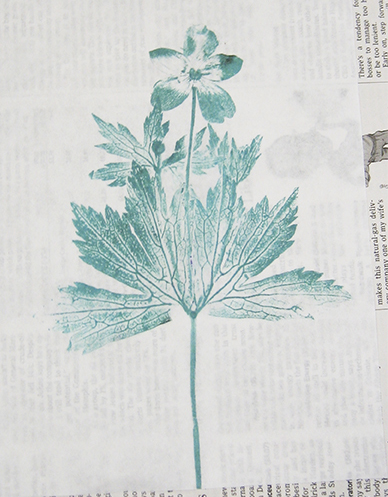
For me, one of the many rewards of teaching is learning from the students. In June, while demonstrating nature printing at my local library in south Minneapolis, a woman selected a wild anemone (Anemone canadensis) from the specimens I’d brought along. She applied the rolled-out ink to the leaves and blossom, placed the dampened Sumi-E paper over the print, placed a newspaper guard sheet on top of the printing paper, and pressed mightily. This is the resulting print! Isn’t it splendid?


Student print of wild anemone.

What I particularly appreciated about learning from this nature-printing enthusiast was her spontaneity; her daring. With this type of specimen, I had been using a more painstaking, complicated method to record the plant. I learned from this student that my efforts weren’t necessary.

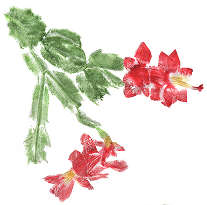
I recalled this valuable lesson last week as I prepared to print a Christmas cactus (Schlumbergera). Instead of setting up my usual involved method, I flattened the specimen slightly in a phone book while preparing my workspace and the paper. Then, I rolled out Akua water-soluble fluid inks with a soft-rubber brayer, gently rolled the ink onto the specimen, and printed. I’m pleased with the result. What do you think?

A spontaneous print of Christmas cactus.

Fresh Art Studio Tour Fall 2014

Once again, I’m pleased to pack my note cards, prints, printing supplies, and PJs to participate in the Fresh Art Studio Tour in western Wisconsin. The leaves along the Mississippi River and in the Chippewa River Valley will be at or near their colorful best, and I’ll happily be printing a few of them as the fortunate guest artist at Flaming Fire Art Studio, site 12.

Ceramics artist/painter, Kaye Luetke, and her husband John heartily welcome guests to tour their colorful gardens and studio. Be captivated by the beauty of Kaye’s work, try your hand at a raku firing led by John and Mark, print a leaf, enjoy some treats, & stop by our rented Port-O-Potty before succumbing to the beckoning curves in the hilly roads on your way to the next studio of a nearby artist.

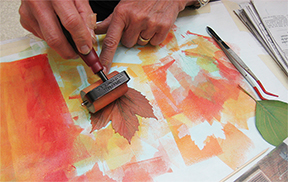
Sandy applies printmaking ink to the underside of a leaf during a recent class.

Spontaneity

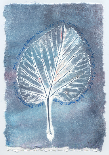
Planning and making lists, sketches, and so forth is usually useful, but sometimes it’s invigorating—and even daring—to just dig in. Today I want to drop off an early-morning note to a neighborhood friend who’s in the midst of cancer treatment. Jeannie has seen all of my cards—some more than once. “What can I do?” I wondered. My answer was to dive into my stash of scraps, pull out something, and work with it—quickly. The dogs and I will drop this off when we head out for our morning walk.

A soft version of a linden leaf from the trees that line our boulevard.

Fun with butterflies and milkweed leaves

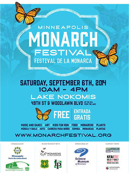
Last year at the Monarch Festival, when volunteers and I guided guests to print common milkweed leaves in honor of Monarch butterflies, the temperature reached 94 degrees. This year the high temperature is expected to reach 74 along with light winds. Nevertheless, along with 350 sheets of paper and plenty of Akua ink, rocks are packed to hold down our piles of paper. I look forward to seeing you amidst the butterflies as you print a common milkweed leaf near the east shore of Lake Nokomis in Minneapolis, MN.

Thinking about ink

As I was printing this afternoon, I was thinking of you—and the questions about ink that come up during classes and demos.

Your prints will be more interesting if you mix one ink color with another, or, as an alternative, “dirty up” the ink by adding a tiny amount of black ink. Using ink straight from the tube just looks too ordinary.When mixing colors, place a “nurdle” (a small amount) of the lighter color of ink on your palette. Add to that nurdle a squeeze of a second color—the darker and more influential color.

The palette
A palette is the smooth surface on which we roll out the ink and also apply the ink to the specimens. Any smooth, flat, clean surface works including a piece of glass, Plexiglas, quilter’s Mylar (available at Joann for about $4), or a piece of Reynold’s freezer paper with the shiny side placed facing up, held in place on a smooth table with masking tape.

Details about ink
Speedball water-soluble printmaking inks are affordable, readily available, easy to use, and enjoyable. What’s fun about these inks is that although they dry fairly quickly, your mixing palette can be “reactivated” by misting it with water from your spray bottle. The colors I always have nearby are the primary colors—red, yellow, and blue—plus black, green (it’s difficult to mix a true green from blue and yellow), dark yellow, turquoise, metallic gold, and extender. Brown, orange, and violet (purple) are pleasing colors, but not essential. Dark pink, while a favorite with young girls, will stain your soft-rubber brayer and is not as lightfast as the other inks mentioned above.

Extender is a magical component in the printing process. Extender is a colorless medium that “extends” color, stretching the pigment you add to the extender by making the color less intense or more transparent. Treat the extender as your lighter color and add your inks to it—in small amounts.

The process of inking your specimens
The word “specimens” seems scientific, but it pertains to the botanical materials nature printers print. In our case, the botanical materials—or specimens—are the plate, just as a carved linoleum block or block of wood is the plate for a printmaker making relief prints. The surface in both nature printing and relief printing is raised to receive the application of ink that is applied with a soft-rubber brayer.

You can always add more ink to your palette, but if you start your print-making process with too much ink, you’ll waste ink and your time getting the ink to the right consistency. That consistency appears to have the same surface as medium-grit sandpaper—in other words, fairly smooth.

After squeezing the nurdles of ink onto your palette, smear them quickly with a palette knife or plastic picnic knife—just a couple of quick strokes—in the same manner you’d spread peanut butter on a piece of toast. The flattened nurdles of ink are now more likely to blend somewhat together instead of remaining as dot-like shapes on your palette. I seldom mix the inks with the palette knife until a new color is created; I usually allow some mottling or unmixed colors to occur.

Ink has tack—stickiness—which allows the ink to stick in tiny points to the surface of plates, linoleum blocks, or leaves in our case. This tack protrudes slightly from the surface of the ink. To achieve the most refined detail when printing leaves, it’s best, after working the ink with your brayer from left to right and top to bottom, to move your brayer in one direction—away from yourself. You’ll continue that movement when applying ink to the underside of your leaves (where the veins are more prominent). Start applying ink at the base of the leaf, moving your brayer with a very light touch, toward the tip of the leaf. Follow the grain or direction of the veins so as to cover the surface of the leaf with a light, even application of ink. Remember to ink the stem of the leaf before making your print.

A recent discovery I’ve made is to have a second leaf of the same type that you’re printing to refer to when trying to match the green color of the top side of the leaf. In yet another surprising observation of the beauty and diversity of nature, when I really pay attention to the leaves I print, the top side of the leaf usually has a deeper color than does the underside.
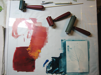
My palette is a piece of glass from a neighbor’s former back door that was in the alley for trash pickup. I would smear the nurdle of turquoise ink in this photo with a palette knife before working it with the brayer.
Resource blog for artists

As a subscriber to the magazine “Professional Artist,” I receive emails from the publication. I’m glad I paid attention to tonight’s email as I was taken to a blog post entitled “10 Facts You May Wish You Learned in Art School.” Having not attended art school, I was especially interested! Well, the info in the article and its links was pertinent and helpful. The blogger is Renée Phillips, “founder and director of Manhattan Arts International. She is known as “The Artrepreneur Coach.” I encourage you to pursue this resource.

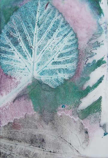
Linden, hydrangea, and prairie smoke leaves.

Art Crawl Through the Gardens

What an exciting summer! I’ve learned a lot, printed quite a bit, and met many of you. Thank you for what I learn from you in class and at demos. Your questions enable me to explore my methods and materials, which lead me to a greater understanding of nature printing.

My next opportunity to learn from you, and show and sell my work, is when I set up a tent borrowed from mosaic artist Julie Reeve to participate in the Minnesota Landscape Arboretum’s second Art Crawl Through the Gardens. I’m so excited and look forward to seeing you at the Arb on August 16 and 17, 2014.

Dazzling art and gardens

The most splendid, engaging convergence of art, native plants, delightful people, and refreshments will take place this Friday & Saturday, July 18 and 19th, at the home & garden of Paul & Susan Damon. This is their 7th-annual Art Sale and Garden Tour.

The garden, at 355 Cleveland Ave. No., (on the southwest corner of Cleveland Ave. No. & West Roblyn Ave., St. Paul, 55104) is a certified Monarch butterfly way station and pollinator habit. Susan and Paul are growing plants I’ve only read about! It is dazzling!

Paul and Susan’s home and garden, the site of their 7th-annual Art Sale and Garden Tour.

Paul Damon—oil paintings—http://www.pauldamonlandscapes.com

Susan Damon—hand-marbled papers

Liz Carlson—collage

Sue Filbin—nature prints & note cards

(including intermittent hands-on demos)

Fri., July 18, 5–9 P.M.;  Sat., July 19, 11–5

Paul and Liz are both working artists who are staff members at the wonderful Wet Paint Artists’ Materials and Framing in St. Paul, MN. Both are accomplished artists as is Susan. Also, I learned a lot as a student in Liz’s exuberant, creative collage class this spring through St. Paul community education. Please plan to stop by—and tell your own creative friends about this inviting event. Thanks so much! We look forward to seeing you!

Here is the postcard Paul designed for his 7th-annual art sale and garden tour.

Discoveries

Often during a class or demonstration, I’ll remind people to place the inky brayer on its stand or to keep track of which side of the paper is the right side. It’s easy to become absorbed in the printmaking process; to get excited about the possibilities of color and pattern and lose track of things.

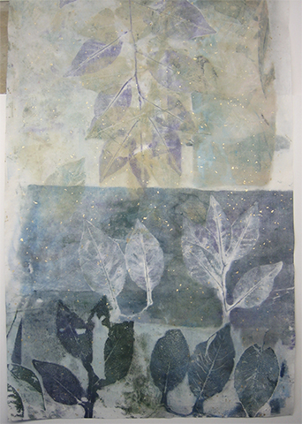
Well that happened to me last night. I was intrigued by the patterns that developed on my palette and decided to make those patterns part of the print of a twig from a tart cherry tree. In the process, I printed some images on the front side of the paper and some on the back. I know better, and the front was easy to determine because of the specks of gold leaf in the Sprinkle Gold paper from Wet Paint. Because the paper is somewhat translucent, this type of error can occur, although it may not be an error at all—simply a new way of looking at a familiar situation.

And as I looked at the print, and emailed the image to my teacher, she raised the question of whether the print is most appropriately viewed vertically or horizontally. What do you think?

The “right” side of a print of a tart cherry tree twig on Sprinkle Gold paper.

The print’s “wrong” side, shown in a horizontal orientation.

Lucky winners

Following my participation in the annual Art-A-Whirl event in northeast Minneapolis last weekend, I feel as though I am a lucky winner to have had that opportunity to show and sell my work. What fun! Thank you if you stopped by to visit, and if you purchased some of my note cards or provided me with your email address for a drawing to win one of my prints.

The small slips of paper with contact information were put in a basket and tossed around. My friend and fellow exhibitor, Kim Gordon, closed her eyes and plucked one of the slips from the mound of papers. The lucky winner of that drawing was Al, who lives in south Minneapolis and was also my art teacher at Minneapolis Central High School a mere few decades ago. Al was among the friends, students, neighbors, and colleagues who received my emailed notice about events and classes that you can also view on the “About” page here.

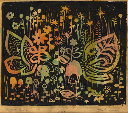
What’s especially meaningful about Al winning the print is that I learned about printmaking from him. He also introduced my classmates and me to calligraphy with a C-series broad-edge Speedball pen nib. The first print I ever made was a linoleum cut. The material was a flat rectangle of green linoleum with a burlap back. We used Speedball cutting tools to incise the design in the linoleum, cutting the pattern into the soft surface. Tissue paper was glued to heavy paper, the linoleum was coated with black printmaking ink, and a print was made. You can see that aged, yellowed print below. Even long ago I was interested in recording the beauty of plants.

WordPress Themes