Combining lettering with nature printing

Recently my friend, Dee, called to ask if I would letter a quote she wanted to give to her dear friend, Mary, who was dealing with three types of cancer, one of which was in stage four. The quote, by poet Mary Oliver, was a favorite of Dee’s friend. I thanked Dee for her offer to pay me but decided to letter the quote as my support for Mary.

When I became consumed by nature printing in 2002, practicing lettering—along with weeding gardens, mending clothes, and countless other activities—weren’t priorities anymore. So, I was concerned about doing this lettering, but after absorbing the encouraging perspective from the book Brave Intuitive Painting, I cast aside my doubts and dove into the project with joy. My plan was to combine the Mary Oliver quote with a nature print.

Step one was to type the quote into phrases so I could judge its length and shape. Then, after digging into my stash of nature prints, I found a print of a violet. The composition seemed weak, particularly because the stem was perpendicular to the bottom of the paper. “Artistic license” on my part had created another flaw: the leaves and flower belonged to a white violet—Viola canadensis—but I had printed the flower with purple oil paint, knowing a white flower wouldn’t be noticeable on white paper. Hoping Dee’s friend wasn’t a native plant specialist, I carried on.

I photocopied the print of the violet, tilted the page so the violet’s stem was at an angle, and practiced lettering near the image. The style, size, color, and movement of the lettering varied with each subsequent practice page as did the relationship of the lettering to the violet. Surprisingly, lettering done slowly-but-happily with a soft pencil proved to be the guide for the final lettering.

With the pencil layout placed on a light box (underneath the violet print), I diluted some walnut ink, loaded a Platignum fountain pen, took a deep breath, and began lettering. The thought of my friend, Dee, honoring her friend, Mary, accompanied me as I created each letter of the quote. While I was “in the groove,” I placed the pencil layout beneath another violet print, and lettered the quote for Dee. I was honored she’d asked for my help, and as is usually the case when helping someone, I received more than anyone by learning of a meaningful quote, being reminded of my affection for lettering, and having a story to share with you.
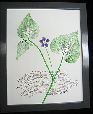
A phrase by poet, Mary Oliver, is combined with a print of a violet.

Preparing for Lisa’s 6th-annual Art Boutique

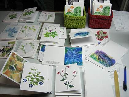
Perhaps the energy remains from my scouting days when I learned the motto “Be prepared,” but I’m all perked up to be preparing for the 6th-annual Art Boutique hosted by my neighborhood friend, Lisa Lardy, a photographer and interior designer. Below is the invitation Lisa prepared. Below that is a photo of nature-printed notecards that I’m happily folding and pairing with an envelope. The images on the cards are scans of original prints of plants from our gardens and neighborhood. The scans are reduced in size, then output by a Canon inkjet printer onto acid-free notecards. Please stop by to look at everyone’s creative work, visit, and enjoy refreshments.

Fresh Art Studio Tour

Thank you if you stopped by Flaming Fire Art Studio, site #12, during the Fresh Art studio tour last weekend to view our artwork, eat cookies, and visit. We really appreciate your interest, and you. The weather was just right for a fire, hot drinks, and conversation about Kaye’s fanciful, colorful ceramics; Juli’s hand-felted, dyed, and constructed jackets; and my nature prints and notecards. Thank you for your sincere, sparkling comments and questions.

This is the inactive blog I warned you about and that was listed on my handout. You’ve inspired me to get back to it, and to show some work. I thank you for this.

Kaye, Juli, and I will be among ten artists at Lisa Lardy’s not-to-be-missed 6th-Annual Art Boutique on Saturday, November 10, from 10 A.M. to 5 P.M. at 4901-11th Ave. So. in Minneapolis. Pack your vehicle with a friend or four, stop by the boutique, then have lunch at Pepito’sTown Hall TapTurtle Bread Co., or 3 Tiers—all nearby. We look forward to seeing you!

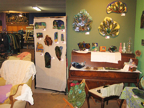
Kaye Luetke’s ceramics shown in her studio near Maiden Rock, WI.

Juli Henriksen (left), Juli Jackets, with some of her creative jackets and vests.

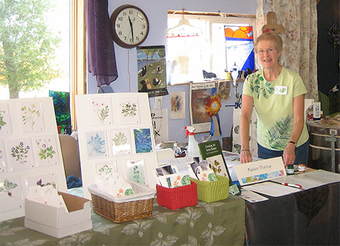
Here I am shown with a few notecards and a tablecloth woven from a print of elm leaves.

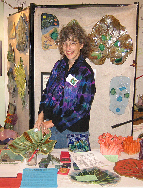
Kaye, shown with pieces made by students who take classes from her in her inspiring studio. Kaye is wearing a Juli Jacket.

Vocabulary word: Risible (pronounced rizible)—comical, amusing, silly, able to provoke laughter

Donating art

A year ago, when a painter friend, Jean Leuthner, http://jeanleuthner.blogspot.com/ invited me to donate one original artwork to a non-profit for which she was volunteering, the simple size of 5” x 7” just wasn’t possible. My prints were either too large or too puzzling to be cropped to that size.

This year, when emails arrived from Jean and photographer friend, Lisa Lardy, http://lardyphotography.com/ I was ready to participate in Art 4 Shelter, http://www.art4shelter.org/home.htm, a benefit to raise money for Simpson Housing Services http://www.simpsonhousing.org/

At the 2-hour preview tonight, hundreds of art enthusiasts viewed the 1,200+ donated artworks prior to the sale. I was dazzled by the quality and diversity of the work, wishing I could return another time to admire the creativity and generosity of hundreds of local artists. I’m already thinking about what to donate next year!

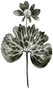
One of the prints I donated was of bloodroot. I admire this spring ephemeral more than ever now that the blossoms I’ve pressed from violets, periwinkle, and marsh marigolds have shrunk and wrinkled in our phone book. The bloodroot blossoms stayed flat and agreeable throughout the printmaking process!

Vocabulary word: lachrymose—tearful, mournful

Nature printing and calligraphy

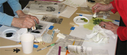
Recently 15 members and friends of the Colleagues of Calligraphy http://www.colleaguesofcalligraphy.com/ learned to print blossoms and delicate specimens. We printed the top side of pressed bloodroot flowers (that were reinforced with contact paper) by applying oil paints with a cosmetic-sponge dauber.

We also printed sage, Italian parsley, radishes, and hosta leaves on 90-pound dampened Arches Text Wove paper. Everyone seemed to have fun and made some wonderful prints.

Vocabulary word:
Avuncular—kindly, congenial, benevolent

Printing radishes

I’ve been printing radishes lately. When shopping for radishes, I look for specimens that have nice, hairy roots and leaves that aren’t shredded and wrinkled—the opposite qualities from radishes to carve into roses or fling into your potato salad. I’ve discovered that grocers display radishes to feature the bulbs, meaning they’re resting on their leaves. It’s no wonder the leaves are so disheveled!

Printing a radish
Before printing a radish, I wash the whole bunch of ten or so in a bowl of cool water, let them air dry on a dishcloth, and refrigerate most of them. Two or three end up in a phone book (or other publication with uncoated-paper pages), with the leaves flattening gently for about a half hour as the bulbs dangle outside the pages.

When it’s time to print, I slice the radish from top to bottom, allowing the now-flat surface of the bulb to occupy the same plane as the leaf stems and root. I often also cut the radish away from the leaves, printing the leaves separately from the bulb and root.

With a dauber, I apply oil paint to the leaves (to the underside where the veined pattern is most prominent), the root, and the flat face of the radish. The painted surfaces are then pressed onto dampened paper to reveal the winsome character of the lowly, spicy radish.

Vocabulary word:
Asperity—sharpness, tartness, harshness, abrasiveness, acerbity, astringency, roughness, severity, sarcasm.

Participating in the Women’s Art Festival

More than 125 women artists showed their appealing work at the Midtown YWCA in south Minneapolis.

Thank you if you attended yesterday’s 19th-annual Women’s Art Festival. http://womensartfestival.com/ A special thanks if you stopped by to visit or purchase one—or 36—of my note cards! I really appreciate it and am so grateful when someone is aware of the beauty of nature.

Sharing nature printing at a demo

I had such fun demonstrating nature printing last night during an open house at what will become, following renovations, the new permanent home for the White Bear Center for the Arts (WBCA). http://whitebeararts.org/ The staff, board of directors, volunteers, members, and community are collaborating with great vision, energy, and generosity to enable more people to “…celebrate the joys of art”—one of the goals of WBCA.

Guests were so interested in the shapes and patterns that were created by the inked leaves, observing beauty they hadn’t really seen before. Danielle Cézanne, WBCA education director, and I hope to offer a nature printing class in winter or spring 2012, so please watch class listings.

The Nature Printing Society (NPS) http://www.natureprintingsociety.info/ is the best source for information about printing plants, and fish, shells, insects, and many other natural specimens. And the book I recommend was co-authored by my teacher, Sonja Larsen, and John Doughty, both of whom are lifetime members of the NPS. http://www.natureprintingbook.com/

In response to the terrific questions that were raised in our conversations last night, a few responses are below.

Yes, I make numerous prints from the same leaf—until I’m no longer happy with the prints. Some leaves are tender; many are quite durable, particularly tree leaves.

The supplies used in the demo were all from Wet Paint, where I purchase all of my supplies, which, by the way are minimal and affordable. http://www.wetpaintart.com/

• Speedball water-soluble block printing inks (You may also use oil-based inks or paints. Oil-based media can be cleaned with vegetable oil rather than solvents.)

• Speedball soft-rubber brayer (used to apply ink to the leaf)

• Paper: Sumi-E from a pad or Masa that comes in a flat sheet measuring 21×31 inches (dampen the paper and print on the top, or smoother side, of the sheet)

• Freezer paper, or a piece of quilter’s mylar (12×18 inches from Joann), Plexiglas, or window glass for a palette

I will be demonstrating nature printing the weekend of Oct. 7-9, 2011, as a guest artist at site #12 at the Fresh Art tour in colorful, scenic western Wisconsin where leaf color will be glorious. I hope to see you there!  http://www.freshart.org/

Printing a maple leaf

Excited about acrylic paints

I attended a free 2-hour seminar last Sunday at the White Bear Center for the Arts on using acrylic paints, gels, mediums, etc. The terrific instructor, Bonnie Cutts, was a “working artist”, a consultant trained & paid by Golden Artists Colors, Inc. The company has a lot of info on their website, including videos, for learning how to use their products.

I don’t intend to become a painter (I’ve got enough distractions & diversions already!), but the creative possibilities with acrylic media are inviting & intriguing. One can tint the acrylic medium to create subtle, colorful built-up layers; fasten materials to a collage; make an acrylic skin and print on it with an inkjet printer; and much more!

On the way home, I stopped at Wet Paint to get some papers for the upcoming nature printing class at White Bear Center for the Arts Sat., Sept. 25. As I was telling Langen, one of the knowledgeable, personable members of the Wet Paint staff about the uplifting experience I’d just had, Langen told me that all of the Golden products are on sale at a 40% discount through the end of September!! Naturally I purchased some and plan to test them for printing leaves, intending to work acrylics into the class curriculum. Isn’t life exciting?!

Inspiring new book

I can barely sit still. Just delivered was a book I ordered in May that I purchased with “doubloons” given to me by friends, Lotus & Edward.

The name of the book is: Eco Colour: Botanical Dyes for Beautiful Textiles by India Flint.

The color photos are very appealing & illustrative of processes and materials.

Some (but not all) of the information covered in various chapters covers: natural dyes—a context, collecting plants, equipment & a place to work, harvesting & storing plants for dyeing, preparing to dye, mordants, processing plant dyes, eucalyptus dyes (the author lives in South Australia), beyond eucalyptus, special effects, resists, solar dyeing, disposal of wastes, further readings, and websites.

Who knows how much overlap there is with botanical specimens in Minnesota, but I’m eager to try. Our garden may evolve from growing plants to print and attract bees and butterflies to adding plants from which I can make natural dyes. I’ll keep you informed!

I must be productive until the end of the day when I may sit on the porch and gaze through this magical book.

WordPress Themes